The Better the Design, the More Invisible It Becomes
When things are going well in a design, we don’t pay attention to them. We only pay attention to things that bother us.
It’s like an air conditioner in a conference room. Nobody ever interrupts our meetings to tell us how comfortable the temperature is. They don’t even notice.
We only notice the conference room temperature when it is too cold or too hot. Or perhaps we notice if the unit is too loud or is leaking all over the floor. But when it’s working perfectly, it becomes invisible.
The same is true with online designs. We attend to things that aren’t working far more than we attend to things that are. When the online experience frustrates us, we pay attention to its details, often because we’re trying to figure out some way to outsmart it.
Not Great for the Portfolio
Unfortunately, this is not good news for those of us who want people to know what we do. If we do our job really well, nobody can see what we’re doing. It’s only when we do it poorly that we have something to show.
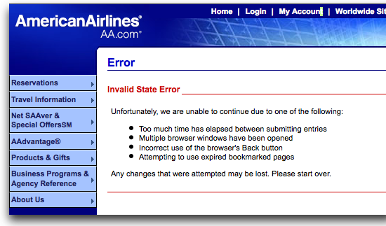
Take this error message from American Airline’s website that popped up when a test participant was trying make a reservation:
 Ignoring the the reasons listed above, what is the user supposed to do next? Their reservation was actually processed. (They were about to select seats, but they’d already purchased the flight.) If they started over, as the message tells them to, a second reservation is made, which would create more problems.
There’s obviously some issue with American Airline’s servers that makes them confused in the reservation process. With some hard work and clever fixes, the problem goes away, never to be experienced by another customer.
Yet how does the designer who does that hard work get credit for their effort? It’s possible we need to design a new type of portfolio — one that helps hiring managers see what the design would’ve looked like, had it been poorly designed.
Visibility Through Frustration
Not every Netflix customer we interviewed was delighted with the service. One new customer, who had a list of movies she’d been keeping, found it very difficult to add as a batch. She explained without seeing the site, in detail, each step she took and how frustrating the entire process was. She recounted the screens perfectly.
What makes a design visible is the frustration it brings. In the worst case, it forces the user to think about the design process and the elements on the screen. We hear, “Haven’t any of the designers ever used this?” and, “Why did they design it this way?”
Frustration Applies to the Design, but Delight Applies to the Experience
In our interviews, delighted Netflix users didn’t talk about specifics in the design. They talked about the overall experience. “I used to stress out about late fees. Now I don’t think about it. If I don’t watch a movie for a few weeks, nobody cares. And I love how quickly each new movie shows up in my mailbox.”
As a user becomes more delighted, their attentions focus on how it integrates with the rest of their life. We think of these integration points as a great experience. The design itself is still invisible, but the experience comes to the surface.
Making Designs Invisible
The path to an invisible design starts with eliminating all of the frustration. Techniques, such as usability testing and field studies, are great starting points for seeing our design through the users’ eyes. The very visible, frustrating parts jump right out during these sessions.
When we spend enough time observing the users, we always get good ideas on what will delight them. (How much time is enough? Start with a minimum of 2 hours every other week, then increase from there.)
With every improvement to our design, the design itself should become more invisible. And as we discover new ways to delight our users, we’ll see them focus on the deliverable.
 I am Mumbai based
0 Comments.